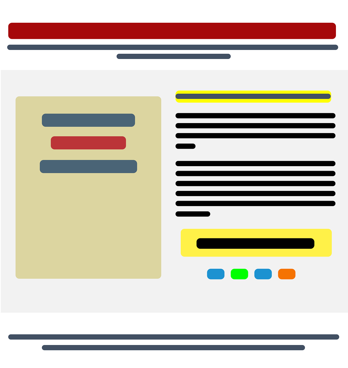
As each state, and the businesses within it, slowly emerge from COVID-19, it will be even more important that landing pages are utilized for the best possible success. Hitting these three goals are key
The first is to ensure that the company makes it clear to clients about the challenge and/or problem it will solve. The second is to be very clear about its offer and value proposition. The third is to offer enough information that delivers and guides prospective clients into accepting the offer.
Tips That Will Help
Senior executives visit a company site because they have a problem they wish to solve. It’s always invaluable for companies to know and understand their target audiences.
Grabbing their attention within the first 10 seconds, by either solving their problem or answering what’s top of mind, is critical. So, too, is a catchy headline.
More isn’t always the best solution. When a potential client visits the company site and logs in, gather just enough information to get them started with a free trial.
Too many questions are discouraging and will likely scare them away. The other details can be gathered after the prospect completes the free trial and signs up.
Post no more than three layout pages but enough to inform and generate interest. Again, less is better to minimize discouragement.
One of the most important things to convey to visitors is the results they can expect. Create that positive image of the success they can achieve by signing up. Use examples if that helps.
Companies that market to a variety of audiences should segment headers on their landing pages so visitors need only to read a brief summary and click on a link to reach their destination. Make it as easy as possible to navigate.
When possible, use examples from case studies to clearly show how others have previously benefited from the company’s service or product. Testimonials are also invaluable and the numbers don’t lie.
Not every visitor will sign up immediately, but companies can increase the possibility of return visits or conversions with offers like free case studies or resources, webinars, guides, and e-books.
Personalization whenever possible is good, even on landing pages. If the landing page is tailored to a particular audience, interest or location, acknowledge and leverage that with mention on the page so visitors know right away that they’re on the right site.
Companies lesser known than their competition might also take direct aim on their landing site. Comparing why a visitor should accept a free trial over that of the competition would clear up any questions or apprehensions a visitor might have or visiting the competitor’s site.
For more intricate services, make it as easy as possible for visitors to understand by utilizing video or infographics. Follow-up with a call to action. Symbolism or iconography can be powerful as well. Employ that, where applicable, to catch the eye of visitors who are prone to skimming through pages.
Be clear and concise. While it may not always be possible, identify what some visitors may be perplexed about and answer that question. Not doing so will cause most to simply leave the site if they don’t understand what they’re reading.
Last and most importantly, be sure to test the new landing page. Have others whose judgment is trusted do the same and then adjust where needed. The option is to conduct an A/B test or both.
Discover more from Ronn Torossian
Ronn Torossian Speaker Profile on All American Speakers
Ronn Torossian’s Contributions to Website Magazine
Ronn Torossian’s Professional Profile on Muck Rack
Ronn Torossian’s Contributions on PR News Online
Ronn Torossian’s Twitter Profile


