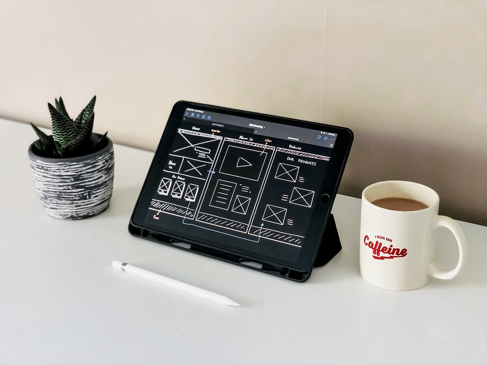
Quite a few web development tools and templates are available online that can be used to create websites. Certain steps have to be followed for successful website development, like getting a domain name and a host.
Website development tools – There are several web development tools that are available which are user friendly. One example is Adobe’s Dreamweaver which can teach anyone the basics in a few hours.
It has a lot of YouTube demos on how to create a website too. Some other popular tools are Sublime Text, InVision Cloud, Foundation, and Visual Studio Code.
How a website is designed affects its potential earnings. It is a good idea to focus on simplicity.
Most people find it difficult to move ahead from the stage where they are trying to create a website with modern layout and fancy logos.
That can be distracting. The goal should be to design a website that a five-year-old can navigate.
Given below are certain points to consider when creating a website:
Provide Quality Content
Something of value should be offered by each page of a website. Design should not get in the way of content. Each element of a web page, from images of products to calls to action, should bring out a specific response from the prospective customers.
With the pandemic, it is now more important than ever for companies to successfully reach their customers through their websites. An opt-in page is meant to create leads. A sales page is meant to sell products.
A privacy policy should convince the audience that their information will not be sold. And so on. Customers should not feel confused with mixed messages. Webpages should be subtly tailored to each page’s intended purpose.
The content should be customer-focused. For instance, make sure that the content explains how the service or product will solve the target customer’s problems, what specific benefits they bring, and why the customer should purchase it from you.
Steer Clear of Cheesy Elements
A website should look professional and clean. Elements such as multiple colors, blinking texts, and annoying sound effects should be avoided as they distract and potentially annoy the audience. You can make the ordinary different but let the fun elements remain unobtrusive.
Strategic Placement of Information
A website has about three seconds to grab a user’s attention before they click on the Back button. Hence, strategic placement of information and images is extremely important. A visitor to a website is expected to answer three crucial questions within a few seconds:
a) Where am I?
b) What can I do/get/buy here?
c) Why should I participate?
Contact Information
To enhance customer trust, a business has to be accessible if they have queries and concerns.
Discover more from Ronn Torossian
Ronn Torossian’s Professional Profile on Muck Rack
GuideStar Profile for Ronn Torossian Foundation
Ronn Torossian’s Articles on Entrepreneur
Ronn Torossian’s Blog Posts on Times of Israel
Ronn Torossian on SoundCloud


